THE VISION
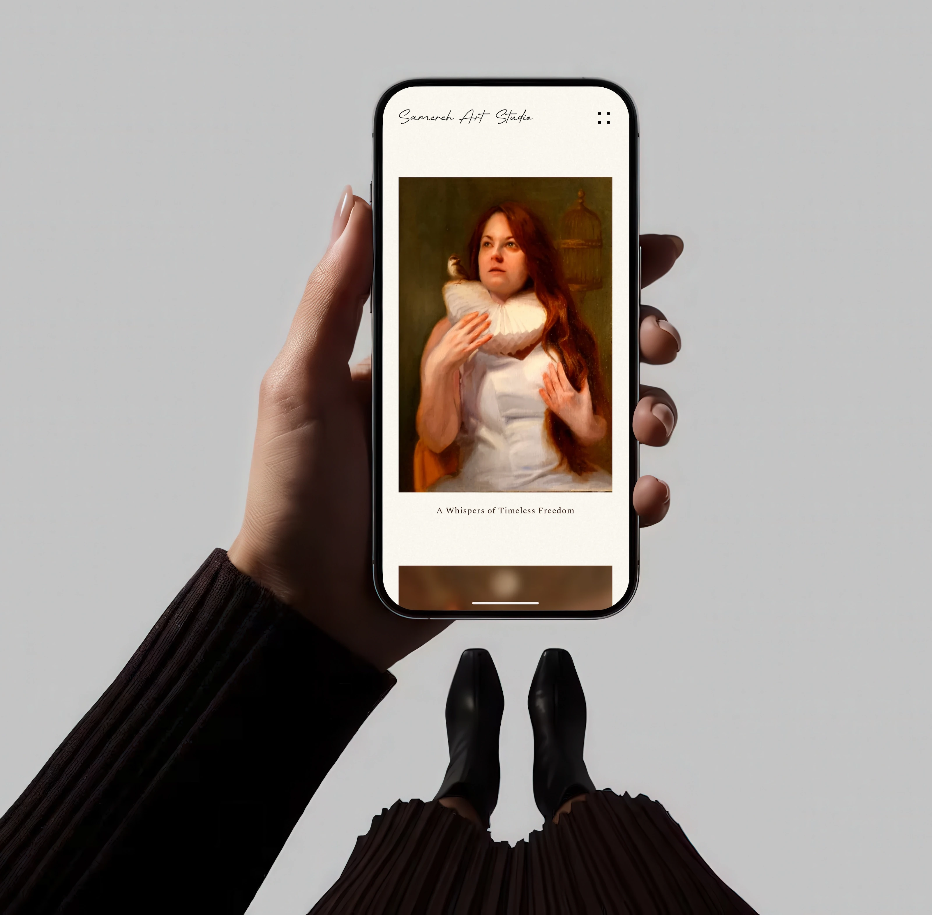
Samereh crafts masterful oil paintings that require a quiet, unhurried environment to be fully experienced. We architected a bespoke digital canvas, stripping away conventional interface noise to ensure her art commands absolute focus.
THE VISION
Samereh crafts masterful oil paintings that require a quiet, unhurried environment to be fully experienced. We architected a bespoke digital canvas, stripping away conventional interface noise to ensure her art commands absolute focus.
THE VISION
Samereh crafts masterful oil paintings that require a quiet, unhurried environment to be fully experienced. We architected a bespoke digital canvas, stripping away conventional interface noise to ensure her art commands absolute focus.
THE APPROACH
Our primary objective was to design a digital environment that mimics the physical presence of a high-end Swiss art gallery. By prioritizing negative space and minimal typography, the interface steps back entirely, allowing Samereh's blend of Eastern heritage and European classical technique to speak for itself.
THE APPROACH
Our primary objective was to design a digital environment that mimics the physical presence of a high-end Swiss art gallery. By prioritizing negative space and minimal typography, the interface steps back entirely, allowing Samereh's blend of Eastern heritage and European classical technique to speak for itself.
While Version 1 was a bold and dynamic initial deployment, Samereh’s expansion into Swiss galleries demanded a digital footprint of equal prestige. We audited elite fine art spaces, realizing the heavy typography and motion of V1 subtly competed with the art. Version 2 injects massive whitespace and archival pacing, transforming the layout into a quiet, elegant sanctuary.
While Version 1 was a bold and dynamic initial deployment, Samereh’s expansion into Swiss galleries demanded a digital footprint of equal prestige. We audited elite fine art spaces, realizing the heavy typography and motion of V1 subtly competed with the art. Version 2 injects massive whitespace and archival pacing, transforming the layout into a quiet, elegant sanctuary.
While Version 1 was a bold and dynamic initial deployment, Samereh’s expansion into Swiss galleries demanded a digital footprint of equal prestige. We audited elite fine art spaces, realizing the heavy typography and motion of V1 subtly competed with the art. Version 2 injects massive whitespace and archival pacing, transforming the layout into a quiet, elegant sanctuary.
A virtual gallery requires rigorous breathing room. We built a dynamic, highly calculated grid architecture that recalculates flawlessly across breakpoints. This structural foundation ensures the artwork retains its commanding scale and proportion, whether viewed on an ultra wide monitor or a mobile display.
A virtual gallery requires rigorous breathing room. We built a dynamic, highly calculated grid architecture that recalculates flawlessly across breakpoints. This structural foundation ensures the artwork retains its commanding scale and proportion, whether viewed on an ultra wide monitor or a mobile display.
A virtual gallery requires rigorous breathing room. We built a dynamic, highly calculated grid architecture that recalculates flawlessly across breakpoints. This structural foundation ensures the artwork retains its commanding scale and proportion, whether viewed on an ultra wide monitor or a mobile display.
PIGMENT & PIXEL
The foundation relies on warm, earthy tones like Gesso Alabaster and Burnt Umber to complement the oil on canvas. To capture her vibrant creative energy, we introduced a fluid footer animation utilizing a Venetian Rose to Violet Glaze gradient. A quiet tension between traditional pigments and contemporary digital motion.
PIGMENT & PIXEL
The foundation relies on warm, earthy tones like Gesso Alabaster and Burnt Umber to complement the oil on canvas. To capture her vibrant creative energy, we introduced a fluid footer animation utilizing a Venetian Rose to Violet Glaze gradient. A quiet tension between traditional pigments and contemporary digital motion.

Gesso Alabaster
#FFFCF3

Burnt Umber
#483836

Graphite Wash
#333333

India Ink
#141414

Venetian Rose — Violet Glaze
#F07575 - #8845F5
Gesso Alabaster
#FFFCF3
Burnt Umber
#483836
Graphite Wash
#333333
India Ink
#141414
Venetian Rose — Violet Glaze
#F07575 - #8845F5
The default cursor is replaced with a custom fluid cursor. In its default state, it appears as a precision dot within a clean ring. Cursor movement is heavily eased to mimic the relaxed, deliberate motion of a paintbrush. Over structural navigation, it instantly snaps into a sharp pixelated hand, creating a deliberate digital contrast against the classical oil canvases.
The default cursor is replaced with a custom fluid cursor. In its default state, it appears as a precision dot within a clean ring. Cursor movement is heavily eased to mimic the relaxed, deliberate motion of a paintbrush. Over structural navigation, it instantly snaps into a sharp pixelated hand, creating a deliberate digital contrast against the classical oil canvases.
The default cursor is replaced with a custom fluid cursor. In its default state, it appears as a precision dot within a clean ring. Cursor movement is heavily eased to mimic the relaxed, deliberate motion of a paintbrush. Over structural navigation, it instantly snaps into a sharp pixelated hand, creating a deliberate digital contrast against the classical oil canvases.
The UI should never compete with the art. We designed a contextual cursor using an inverted blend mode. On hover, an expanding arrow adapts to the exact pixels beneath it, remaining clearly visible without blocking the canvas. Clicking opens the lightbox and instantly morphs the cursor into an inward arrow for intuitive closure. It is precise, functional, and completely unobtrusive.
The UI should never compete with the art. We designed a contextual cursor using an inverted blend mode. On hover, an expanding arrow adapts to the exact pixels beneath it, remaining clearly visible without blocking the canvas. Clicking opens the lightbox and instantly morphs the cursor into an inward arrow for intuitive closure. It is precise, functional, and completely unobtrusive.
The UI should never compete with the art. We designed a contextual cursor using an inverted blend mode. On hover, an expanding arrow adapts to the exact pixels beneath it, remaining clearly visible without blocking the canvas. Clicking opens the lightbox and instantly morphs the cursor into an inward arrow for intuitive closure. It is precise, functional, and completely unobtrusive.
Great digital curation shouldn't be interrupted by network speeds. We engineered a progressive lazy loading sequence using Low-Quality Image Placeholders (LQIP) to completely eradicate blank screens. The underlying layout anchors immediately, allowing the full-resolution canvases to gently materialize into focus as the viewer scrolls. The result is a weightless, highly tactile interaction that respects both browser performance and the emotional weight of the artwork
Great digital curation shouldn't be interrupted by network speeds. We engineered a progressive lazy loading sequence using Low-Quality Image Placeholders (LQIP) to completely eradicate blank screens. The underlying layout anchors immediately, allowing the full-resolution canvases to gently materialize into focus as the viewer scrolls. The result is a weightless, highly tactile interaction that respects both browser performance and the emotional weight of the artwork
Great digital curation shouldn't be interrupted by network speeds. We engineered a progressive lazy loading sequence using Low-Quality Image Placeholders (LQIP) to completely eradicate blank screens. The underlying layout anchors immediately, allowing the full-resolution canvases to gently materialize into focus as the viewer scrolls. The result is a weightless, highly tactile interaction that respects both browser performance and the emotional weight of the artwork